Blending CSS Gradients Like Photoshop
While on my day job over at Company 52, I encountered a textured background with a gradient overlay, using Photoshop’s overlay blending mode. I’m sure you’ve seen this effect before:
My first thought was to save the texture as a 4×4 PNG for tiling, and to save the gradient as a PNG with alpha transparency to overlay over the tiled pattern. This would certainly be lighter than saving a monolithic image, but this presented several problems:
- The size of the gradient PNG was still too large, especially when the gradient can be done in CSS
- The gradient overlay would be overlaid like Photoshop’s normal blending mode, not in the desired overlay mode, which would make the background look washed out.
CSS blending modes would solve this, but they aren’t here yet (you can do it with the HTML5 Canvas API, but that’s messy).
A Layered Approach
On a close examination of the pattern, you can see that the gradient only affects the lighter dots, suggesting a layered approach to simulate the desired affect:
- Top layer: create a new tiled background image like the original one, but with the lighter dots which should be affected by the gradient overlay erased, leaving only the darker ones.
- Middle layer: the desired CSS gradient.
- Bottom layer: the original background image.

Implementation
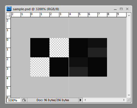
My new foreground and background tiles ended up looking like this:
 <figcaption class="wp-caption-text">Left side: foreground tile; Right side: background tile</figcaption></figure>
As you can see, the foreground image acts as a screen which overlays the CSS gradient, restoring the desired contrast of our background much like Photoshop’s overlay blending mode.
Assembling the layers was easy with CSS3 multiple background images (vendor gradient prefixes are omitted for clarity):
background-color: rgba(128,128,128,.05);
background-image: url(background.png);
background-image: url(foreground.png), radial-gradient(center top, circle closest-corner, rgba(255,255,255,.25) 0%, rgba(0,0,0,.1) 80%), url(background.png);
background-position: top left, center center, top left;
background-repeat: repeat, no-repeat, repeat;
This gradient CSS generator was very helpful.
Older browsers will gracefully degrade to the original background image.
Demo
Voila! A nice Photoshop gradient overlay effect, implemented in an extremely lightweight manner with two 150-byte 4×4 PNG images, and a CSS gradient.